Decorative elements
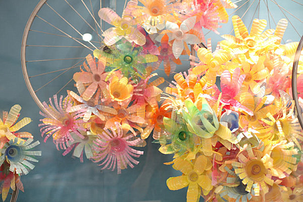
One of the representatives of Indian creativity is Anthropologie, who creates things from plastic bottles. These products look original and impressive.
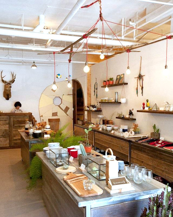
There is a shop in San Francisco that sells exclusively handmade goods. Going there, it is impossible not to admire the variety of jewelry presented. You will leave there with an incredible energy that will encourage you to try to do something like that.
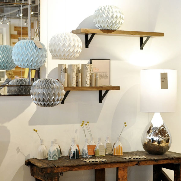
Some trading companies like West Elm collaborate with artists, giving them the opportunity to express themselves and produce some kind of advertising to attract customers. Such partner organizations have become mainstream and represent the treasures of the present time.
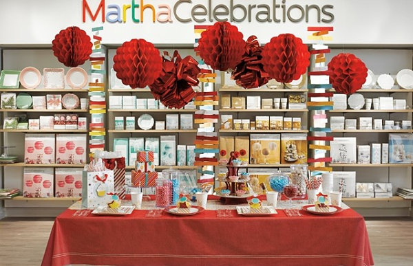
JCPenney built a similar installation to attract attention, but it didn’t help. But art lovers will appreciate such an environment.
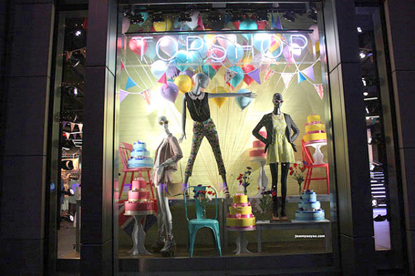
The most chic showcases are in New York and London. An example is the Topshop store in the British capital. The design of its facade gives a festive mood and gives rise to a desire to bake a pie or fill your house with lots of helium balloons.
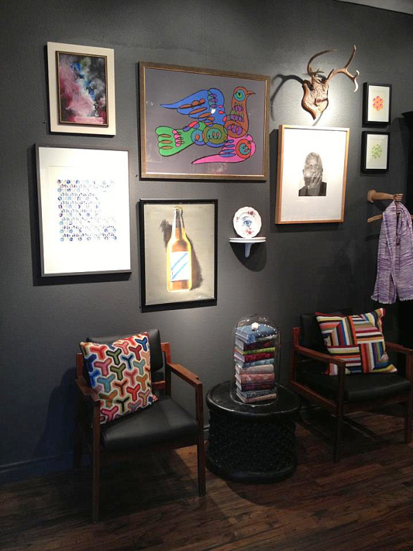
Unusual passages include Mercury Design Studio in Austin, Texas. It reflects a true eclectic approach to design. Here it is possible to follow how styles have changed over time. This method is also used in Hollywood Regency.
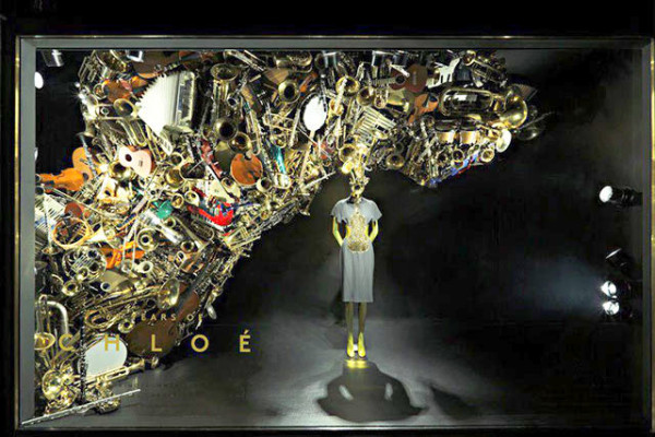
The extraordinary sculpture is located at Barneys in New York. She shows us that all it takes to create an original item is old junk, which is often stored in cabinets.
Smooth surfaces and simple shapes
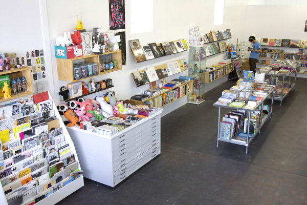
The modern approach to the organization of space is reflected in the appearance of Do my Books in Texas. White walls, counters, wooden shelves, books — everything inspires creativity with its clear lines and colorful accents.
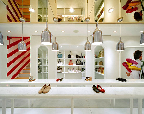
And this shoe department uses metal chrome lamps, emphasizing the luxury of the room.
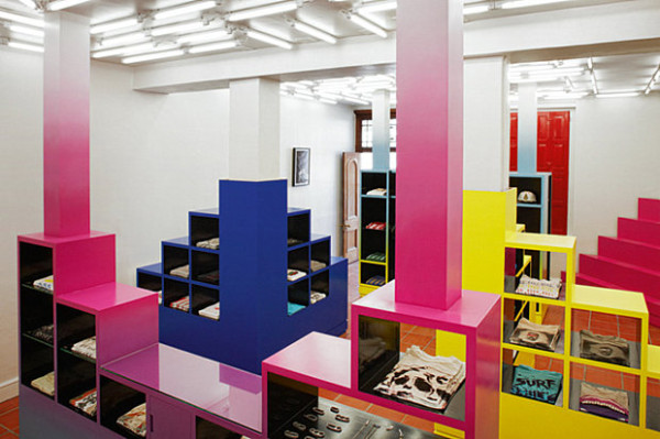
How do you like the original work of designer Rafael de Cárdenas of Architecture at Large? He designed a trading floor with non-banal interior decoration. Multicolored shelves-cubes form steps, cells are reserved for the layout of the goods.
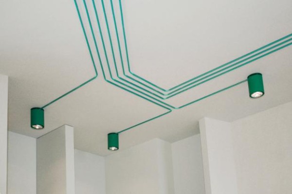
The lighting in Maygreen attracts increased attention. It is made in the form of a computer chip. Such a ceiling can be called a whole work of art.
Retro showcases
The following photo captures the bold use of retro style in retail premises. It is noted that its use contributes to the growth of the rating.
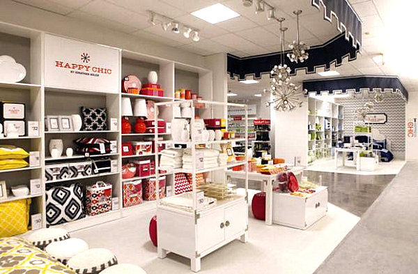
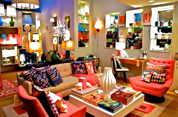
In his works, Jonathan Adler teaches us not to be afraid of bright colors. Pillows, lamps, books, blankets and rugs. It doesn’t matter what to decorate, the main thing is to make it bright!
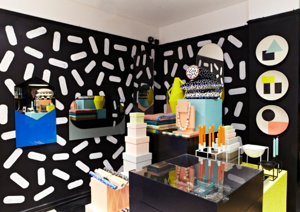
What really takes your breath away is the design of Darkroom London. The room looks like a museum dedicated to the 80s.
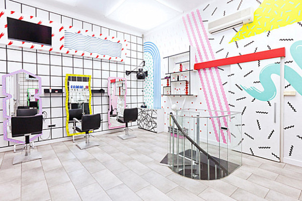
Another successful application of the design of the end of the last century was found in the Kitsch Nitsch beauty salon. The key accents here are vinyl wall stickers, an unusual sofa and mirrors.
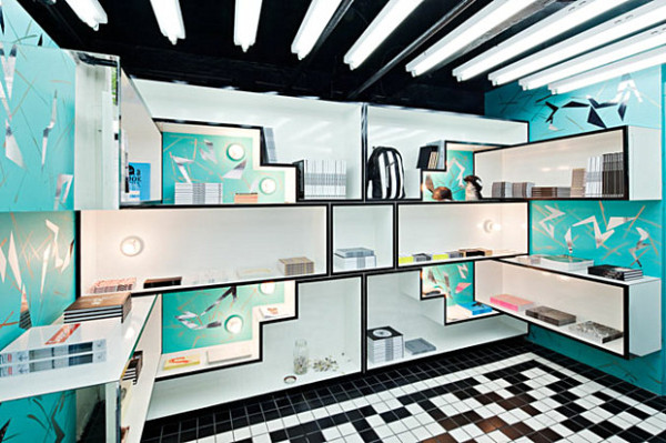
In the Architecture at Large room, two trends have mixed: the 80s and the fabulous motifs of Rafael de Cárdenas. Geometric ornament, contrasting colors and blinding lighting leave an indelible impression. This technique is used in New York OHWOW.
Appearance
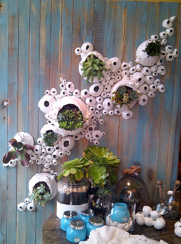
In their plans, you can use flowers and trees, they enliven the interior, bring a piece of nature into it. For example, as on Anthropologie.
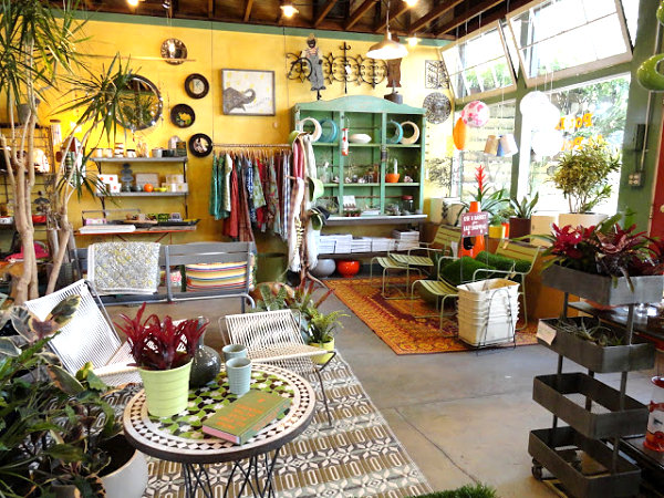
In Potted, Los Angeles, they just love things made of natural materials: thick woven carpets, a variety of potted plants, colorful souvenirs. There is harmony and a combination of the external and internal appearance of the building.
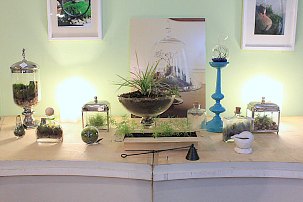
Twig, located in Brooklyn, became famous for its passion for floral decor. It has living sculptures, mysterious little worlds in jars, exotic flowers and much more.
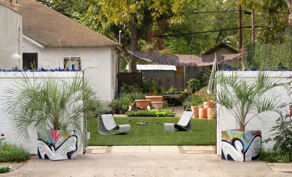
There is a place called Big Red Sun in Austin, Texas. This is an open-air garden. A competent marketing move works to attract customers. Once in the green oasis, you just want to take something with you.
Подпишитесь, чтобы получать полезные материалы:
Нажимая кнопку, вы даете согласие на обработку персональных данных