The real estate industry has its own effective ways of advertising. There are certain promotion trends that are popular with developers. Each company wants to stand out from the background not only of its competitors, but also advertising of other goods and services. For this reason, it is increasingly possible to see a variety of creative ideas in housing advertising.
It happens that the expectation of the maximum result from an advertising campaign in the end remains unjustified. This often happens due to the unsuccessful design of advertising communication. Even if the advertising message is good, without proper design support, it is lost. Therefore, it is very important to follow what is relevant in the advertising of a particular industry and use it in your practice.
So, let’s look at some working and effective techniques in real estate advertising.
So you don’t understand right away.
Trend #1: Don’t Post a Picture of a Home
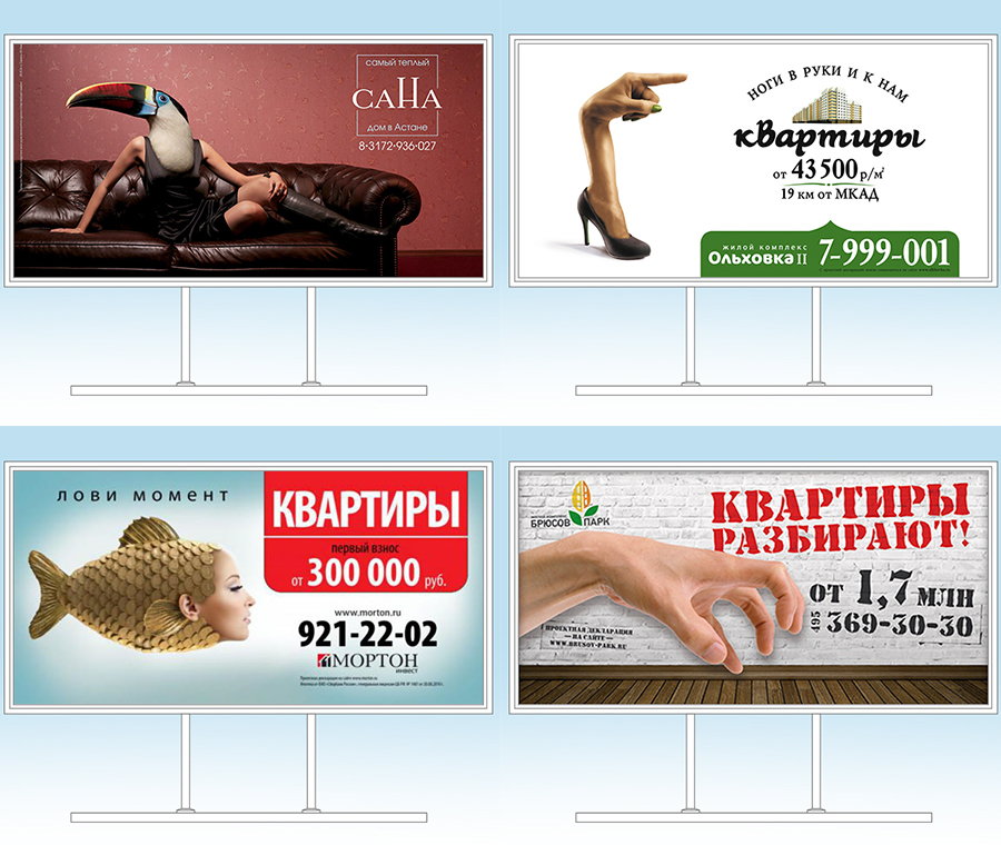
Showing the house, that is, the product itself on a billboard, is not always relevant. This is justified if the appearance of the house is a competitive advantage. For example, the facade looks great in the evening or has an unusual design. Visualization will perfectly replace the image – a well-chosen image that will convey the essence of the advertising offer. The mechanism of action is as follows: the consumer is involved in deciphering the message, falling on the hook of a tempting picture, there is a “game of associations” and then it becomes clear what is at stake. If the layout is good (all elements are large, contrasting and easy to read), this process takes 3-5 seconds. This solution is more interesting for the audience than a banal demonstration of a building object, because:
- intriguing (“wow, what is this interesting ?!”);
- attracts and holds attention (it is necessary to take a closer look in order to understand);
- clearly stands out and looks advantageous against the background of standard advertising of competitors and the information field as a whole.
Happy at home
The second trend is to depict tenants busy with household chores
Why not make the target audience the protagonists of advertising? It is clear that all people are different and it is impossible to portray similar to everyone. The main thing is to show what will be typical for the majority. For example, pleasant household chores that happy owners do in a new, comfortable apartment.
In such ads, there are no stock photos of ideal families smiling with all snow-white 32 teeth. As one of our customers says: “These non-Orthodox faces are immediately visible!”🙂 . Therefore, it is necessary to choose photos of “live” people with sincere emotions that are similar to your consumers.
And with the help of the image of a person, you can sell the idea of “emotions from a purchase.” Only offer not a vague “happiness”, but feelings experienced from specific events: dinner with the family, furnishing an apartment, inviting guests to a housewarming party, etc. It is necessary to think carefully about what you offer so pleasant for the newly minted owners of the apartment, and reflect this in advertising.
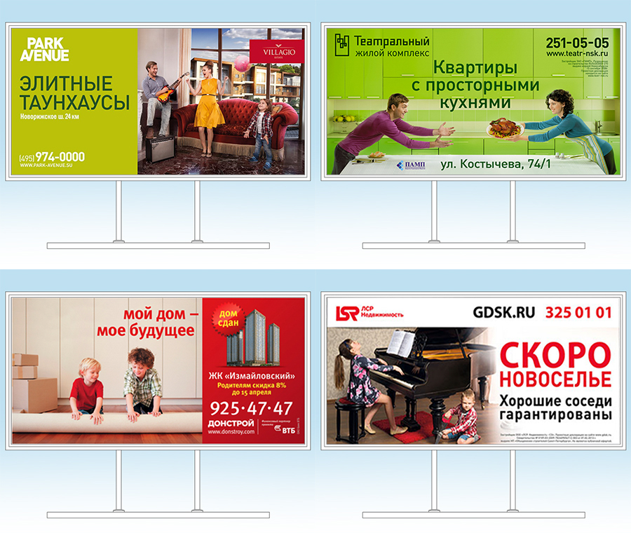
Not an advertisement, but a picture
The third trend is not to use photos, but to draw illustrations
Sometimes the problem is that a photo, even bought on stock, can be used by a competitor. This happens due to the fact that there are not so many high-quality stocks and suitable clipart.
Another common problem is that there is simply not one photo that is suitable for an advertising message.
To achieve uniqueness and reflect the essence of the proposal, you can create an illustration or photo collage.
Drawn communication catches the eye. Realistic images are certainly good, but they also become boring if everyone around uses them. The consumer’s eye is “blurred” by the monotony of the message, and as a result, the billboard remains unnoticed. A colorful illustration with an amusing plot is interesting to look at🙂 .
Such a drawn format is easier for the audience to perceive due to the “packaging” of a serious question about buying a home in a “wrapping” of a colorful message.
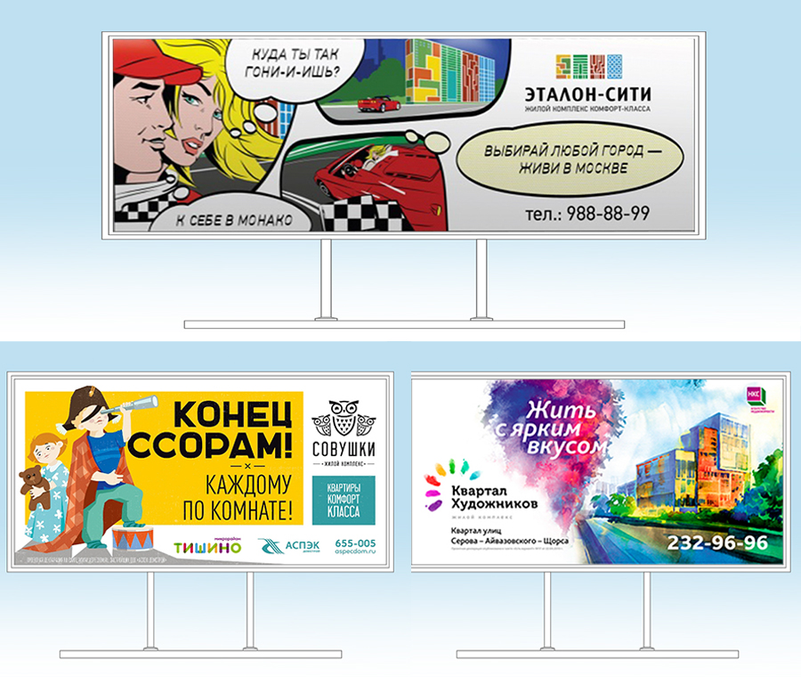
And we have gas in the apartment
Trend Four – Display Key Benefits
There is an excellent reception – they are placed:
- visual representation of competitive advantage;
- abstract or playful slogan to it.
The main advantage of the “product” is shown to the buyer, which is also supported by a convincing, as realistic as possible image. This is great for the subconscious. A person clearly understands what exactly he is offered to buy.
The thought “I want it too!” Is formed. Well, then it is already difficult to refuse the idea of purchase.
Serious about serious
Trend #5: Apply Humor and Situational Marketing
The use of appropriate humor in advertising adds ease of perception. This is a good opportunity to present serious information easier. It also allows you to set yourself apart from competitors, who are mostly used to a dry presentation of facts. This also applies to situational marketing. The reaction in advertising to general trends and ongoing events provides additional benefits:
- be up-to-date at the moment;
- to attract attention due to interest in a news or event;
- the likelihood of media coverage of the advertisement (especially if it is provocative).
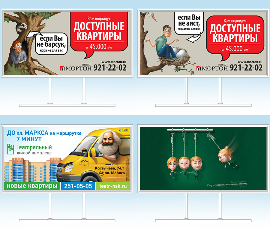
Everyone loves cats
Trend six – use images of pets
Sometimes the protagonists of outdoor real estate advertising are pets. Following the furious popularity of cats on the Internet, advertisers began to place cute little animals on banners and billboards.
What idea carries a fluffy image, sometimes it is difficult to make out. Well, in general, a pet symbolizes warmth, comfort, harmony, and leads to a pleasant thought that someone is waiting for you at home.
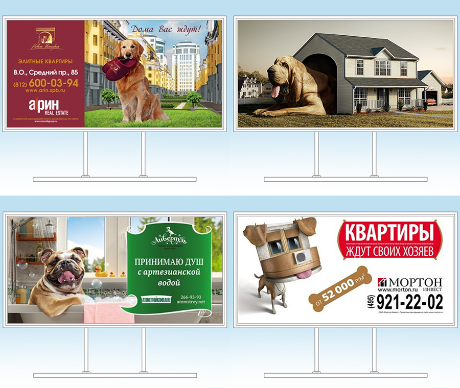
Balancing on the brink
Trend 7 – implement extreme ideas
You can work hard on creative ideas and develop, well, provocative advertising. Sometimes the consumer needs to be awakened, shocked or outraged in order to win his attention.
If you advertise, do not see the desired result, and as a result come to the conclusion that the consumer “passes by” the usual beautiful / high-quality advertising, then this is for you. Just be sure to read the requirements of the FAS and the “Law on Advertising” so that there are no troubles.
To go beyond
Trend eight – use an extender in advertising
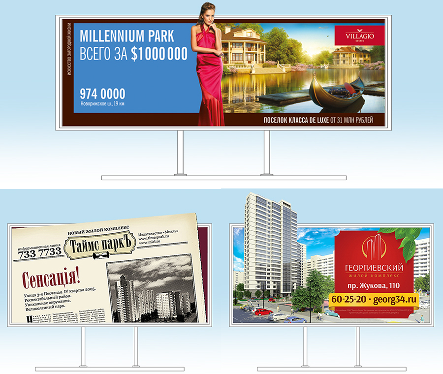
The method of applying an extender (when part of the image goes beyond the perimeter of the structure) is almost the most popular trend in advertising of all types of goods and services. Advertisers’ love for extenders is explained by the many advantages they have:
- advertising is noticeably different from the standard one due to the 3D effect;
- attracts attention due to an unusual way of presenting an advertising message;
- occupies a larger area, so it is visible from afar.
Real estate advertising has not remained aloof from the widespread trend. For developers, an extender is a good way to demonstrate the merits and features of a proposed home.
So, all eight trends:
- do not post an image of the house;
- portray tenants busy with household chores;
- do not use photographs, but draw illustrations;
- display a key advantage;
- apply humor and situational marketing;
- use images of pets;
- implement extreme ideas;
- use the extender in advertising.
This is only a small part of what exists in the advertising real estate market. And imagine how many things have not yet been invented?
You can apply one or more of the described trends in your advertising without reinventing the wheel (these methods really work – how many companies can be wrong at the same time🙂 ), or use your creative hand and create a new trend that everyone else will follow. Try, experiment, be creative and you will certainly find your signature and effective technique.
Подпишитесь, чтобы получать полезные материалы:
Нажимая кнопку, вы даете согласие на обработку персональных данных